The Matching-Set Myth in Casino Interiors
Casino interiors need not match throughout. Learn how contrast, repeated details and coordinated materials can make distinct spaces feel coherent and purposeful.
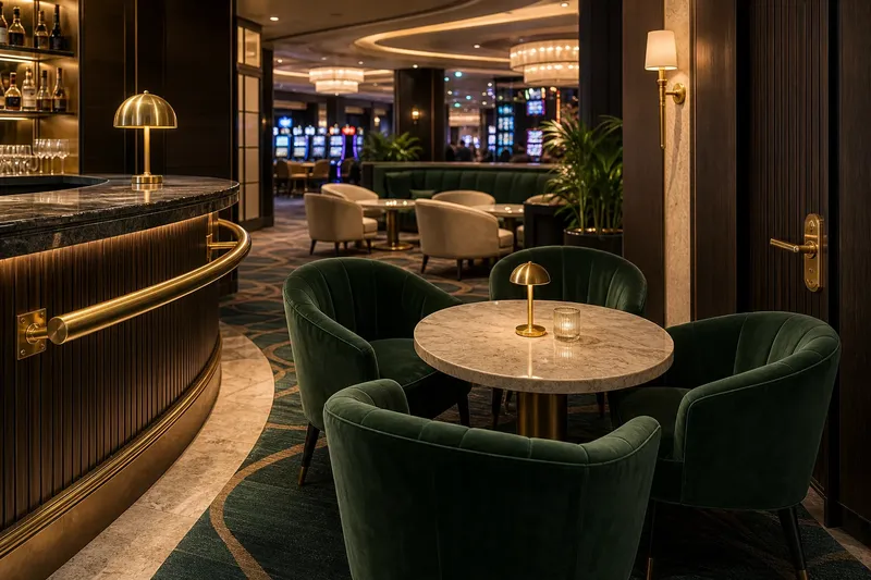
A brass rail catches the light beside a dark stone counter, while nearby chairs wear green velvet. In a casino, these materials can create a composed room without matching. Coherence comes from deliberate relationships—through contrast, repetition or a shared visual rhythm—not from making every surface identical.
Coherence without matching
A matching set repeats the same finish or material across several surfaces: brass on every rail, the same stone on counters and tables, or one upholstery fabric on every chair. That can make a space legible, but it may also flatten the distinctions between a lobby, a bar and a gaming area.
Coherence is the sense that the parts belong together even when they are not identical. It may come from a consistent colour family, a recurring edge detail, or a clear distinction between warm, tactile furnishings and cool, durable surfaces. Like a well-set table, the arrangement can feel intentional through a repeated colour or shape, even when the plates and glasses differ.
For casino interiors, ask what relationship a guest should notice. A room intended to feel calm may rely on quiet transitions, while a lively lounge may use sharper contrasts. The materials should support the room’s purpose and the way people move through it.
Choose by room situation
Start with the situation, not a catalogue of finishes. A material that suits a quiet hotel corridor may seem too subdued beside a busy gaming floor, while a highly reflective surface can compete with displays and decorative lighting.
- Compact, visually busy room: Check whether the large surfaces already compete for attention. If they do, choose restrained, related tones and reserve contrast for a chair or counter edge; if they do not, a stronger accent can provide focus.
- Broad lobby with long sightlines: Check whether distant areas feel disconnected. If they do, repeat a detail such as a rounded timber edge at the reception desk and a nearby table; if they already read as one space, distinguish zones at thresholds instead.
- Intimate lounge: Check whether the furnishings feel flat or overly busy. If flat, contrast soft upholstery with harder stone, lacquer or metal; if busy, relate the materials through a warm undertone and reduce competing textures.
- High-traffic service area: Check which surfaces receive frequent contact and cleaning. If a surface has those demands, choose a finish suited to its use and care; if it is protected from contact, a more delicate finish may be appropriate.
- Room with a strong architectural feature: Check whether the ceiling or wall already leads the eye. If it does, quiet nearby finishes and repeat only a modest detail; if it does not, a restrained material contrast can help define the room.
Imagine a fictional casino lounge with dark green chairs, pale stone tables and a bright brass drinks rail. The rail seems isolated, so the designer adds its warm metal tone to a discreet lamp base and a door handle; the chairs and tables remain distinct, while the repeated brass gives the room a visual link.
Contrast and repetition
Contrast separates materials by colour, texture, sheen or shape. It helps guests distinguish surfaces and gives the eye a place to rest. A matte wall beside polished stone, for instance, can make the stone feel deliberate without repeating it throughout the room.
Repetition creates a thread across separate objects or zones. A narrow ribbed detail on a counter front, screen and host stand can connect them even if each object uses a different material. Repetition works best selectively; too many echoes can make the room feel like a catalogue of motifs.
The two methods can work together. A room might repeat a curved profile across several pieces of joinery, then contrast dark timber with pale upholstery. The shape supplies continuity, while the difference in tone gives each material definition.
Which approach fits your room?
Should every casino surface match?
No. A uniform finish can make a room predictable or obscure useful distinctions between zones. Match materials when a calm, continuous effect is the aim, rather than treating it as a default rule.
How can different materials feel connected?
Give them one or two shared cues, such as related undertones, a repeated edge shape or a common level of visual weight. Keep other properties distinct so the materials retain their own character.
When is contrast too strong?
Contrast may feel disruptive when competing colours, textures and reflective surfaces all demand attention at once. Decide which feature should lead, then quiet nearby finishes or repeat a restrained detail to connect them.
Can practical finishes still look considered?
Yes. A durable counter surface can sit comfortably beside softer seating if its colour or profile relates to the room. Select products for their intended use and care requirements, following manufacturer guidance and applicable local rules.
Check material relationships
Before settling a palette, look at samples together under the lighting conditions the room will use. A finish can appear warmer, cooler or more reflective beside another material than it does on its own. Judge the overall relationship rather than each sample separately.
- Identify the lead material: Check which surface or object should draw attention. If one should lead, keep nearby materials quieter; if none stands out but the room needs a focal point, choose a suitable feature to lead.
- Compare undertones: Place timber, stone, upholstery and metal samples side by side. If their warm or cool qualities support one another, keep the palette; if they clash, adjust one material or choose a more compatible sample.
- Check sheen: Compare matte, satin and polished finishes in the same light. If reflections compete with lighting or screens, reduce the sheen nearby; if the surfaces remain visually calm, retain the contrast.
- Trace repeated details: Mark where a profile, colour or finish appears. If an echo connects separate zones, keep it; if it adds no clear link, remove it or use a more useful repeated cue.
- Consider contact and upkeep: Identify surfaces that need frequent cleaning and those intended mainly for visual effect. If a surface faces regular contact, choose an appropriate robust finish; if it is protected, consider a more delicate option suited to its care needs.
- Read the room from its entrances: Check what guests see first and whether transitions between seating, circulation and service areas are clear. If the zones are hard to distinguish, adjust the material cues at their boundaries; if they read clearly, avoid adding unnecessary contrast.
This check is not a demand for more decoration. It helps establish whether contrast is purposeful and whether repeated details do useful connective work.
Make distinction deliberate
Matching is one option, especially where visual continuity matters more than variety. But casino interiors contain different activities, lighting conditions and levels of contact, so one finish language may not serve every area equally well.
For a coherent room that does not look uniform, choose materials by situation, establish a clear visual relationship and repeat details sparingly. The matching-set myth in casino interiors fades when each material has a reason to be there: some surfaces lead, others recede, and a shared cue brings the room together.